
First impressions are made in seconds. On LinkedIn it is your LinkedIn Profile Picture, your name and your headline that create this first impression. I was pretty happy with my head-shot for years, but there you go: YEARS! it was nearly 5 years old and although I still look stunning as, it was time for an update.
IN THIS ARTICLE YOU WILL READ:
- The hilarious adventures we had doing the photo-shoot
- My top three tips in regard to a LinkedIn Profile Picture
- The top three tips from the photographer I worked with
HILARIOUS ADVENTURES
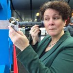
We decided on an outdoor picture, with a background that somehow helps strengthen the message that I work with clients worldwide. This meant I did NOT want to have your very recognisable Amsterdam city-scape. We met at a train station with an abundance of office buildings surrounding it.
I got told off for not having put on a little make up. I quickly popped into the pharmacy at the station to buy some. I’ve seen people put on make-up on public transport heaps of times. See it happen at the ferry daily. I’ve not seen people do their thing in a passageway of a busy train station yet. I just figured it was best to use as much natural light as possible. Now if you thought the place to apply the lipstick was a little funny, how about this? When I was done the photographer took the lipstick off me and applied it to my cheeks! Strange places for lipstick all around.


I AM A PHOTOGRAPHERS NIGHTMARE
 I find fault in every picture. My smile is too big, my eyes too closed. I look insecure, I stare too much. My posture is an inch out of whack. Oh and I just CANNOT pull of facial expressions (such as a natural smile) on cue. When I did more or less get everything right a gust of wind would blow my hair straight up in the air. We weren’t really getting results, but we had great fun. Especially when noticing the commuters walk past, wondering what kind of photo shoot this was.
 After a while we decided to move to the other side of the train station. Little did we know the background was much better there, it was more sheltered from the wind and even the sunlight seemed to catch me at a better angle.
At the end of the day I have to say, Vanessa Lam, from Lam Studios DID manage to get some great images of me. The one I like best are not suitable for LinkedIn though. Now I have just one tiny little problem. Picture #10 has captured me in the best possible way. I look just like I should look for a LinkedIn Profile Picture. Friendly, approachable, confident and businesslike all in one.
SO WHAT IS MY PROBLEM?
I now have 1 pic in which I look absolutely stunning! Yet I have another picture with the best background, making me stand out. Dilemma, dilemma, I don’t know which one to use. I’ll show both options at the end of this post, hopefully you can help me make up my mind.
TIPS BY PETRA FISHER
- Picture needs to support and strengthen your written message. In my headline you read that I work with international professionals; I won’t use tulips and windmills as my backdrop.
- Look directly into the camera. Looking at your profile means I am asking you: “What do you do?” When you answer me, it is nice to have eye contact.
- Head and shoulders. The more of you in the picture, the smaller you become. Networking is about engaging and building relationships so it is important that you are easily recognisable.
3 TIPS BY VANESSA LAM
- Be yourself. Wear clothing that reflects your personality and that you feel comfortable and confident in. If you’re not happy with your clothing, it will show in your face and in the photos.
- Plan on wearing make-up. The camera absorbs a lot of it, so plan to wear some if you never wear any, or about 20% more than you normally wear if you wear some regularly.
- Relax and let the photographer guide you. The majority of people are not comfortable posing in front of a camera or even looking natural on cue.

WHICH HEADSHOT?
◄ ►
Please help me out here. Which headshot should be my LinkedIn Profile Picture? In the comments below give me your option on WHY you be believe the left or right picture is the best fit for my LinkedIn Profile.
◄ ►

I like the top one Petra. On my iPhone there is no right or left. It’s the photo of you looking more directly at the camera. The bottom one looks more casual and seems like your hand is in your pocket which I’m not keen on. The eye contact for me is more approachable in the top pic.
Vanessa did my pics too and I love them all!
The hand thing… SHE made me do it! 🙂 Mind you, the pics were always meant to be used Head & Shoulders only. So anything below doesn’t count. I like it that you find the eye contact in the left one more approachable, as the approachable votes mainly go to the right (bottom) one.
I like the second photo, but I think it should be cropped to a head and shoulders shot to get rid of the tightness of the jacket above the waist. I’d also experiment in Photoshop with lightening the shadows below the cheeks and nose and maybe darkening the eyebrows just a bit.
Just for fun I’d also experiment with some black and white interpretations, just because I like b&w.
Whatever you do, congratulations on a great photo shoot.
It’s an interesting suggestion, the b&w. Might work. It was a fun shoot with many great shots. Maybe Petra will want to convert to B&W to see. Thanks!
Thanks Andy! For me it is such a ‘given’ that I crop a LinkedIn Profile Pic to head and shoulders, that I never thought to do so before showing the pictures. LOL As for BW, I love black and white, and it is always flattering. It is also a bit more ‘arty’ which is why I won’t do it in my LinkedIn. There I want you to feel we are having a conversation as two people.
The right one, hands down!! Very flattering angle of you, and the back drop is funky
Totally agree about the angle, Grace. Yet I prefer the left one for those that don’t know her especially. She can look confident and professional, THEN they can get to know the Petra on the picture on the right. 😉
I keep changing my mind. All the comments are not helping either as the go both ways as well. LOL The background is great in the 2nd isn’t it? Me too, indeed! 😉
Thanks Grace. I like that you find it flattering, whilst most people notice the jacket is too tight. LOL I am using only head and shoulders on LinkedIn anyway, so that doesn’t matter. I actually like both backgrounds. If you like ‘buildings’ then Sloterdijk is a great place.
The right one. The left is great, but slightly more posed. As in Very slightly. But if I have to choose… and I like the city-background.
Thanks! They are both ‘city’ backgrounds. They were taken on different sides of Station Sloterdijk. I like the more natural look of the right one and the more posed look on the left. I mean, we all know I had to pose for a decent profile photo and that it wasn’t snapped at the beach in Thailand. 🙂 I still love the pic that appears with my comments here, but it is 5 years old. Sigh.
Right is much more a typical facial expression you have. The left one seems forced and a bit unnatural. If you go for right, I’ll crop it, b/c the blazer isn’t very flattering. Not in the race, but the one where you are taking a pic with your cel is also typically you.
At the moment (Sunday 12 Feb 2017) I have the right one on LinkedIn. Indeed cropped 🙂 I will change between the two of them I think, as I have arguments for liking both and so do the people giving me feedback.
Right one.
No concrete reason, I just like the right one.
I like them both. Why not alternate them? Every quarter or so switch. Liven the place up!?
Great idea Liz! I thought about alternating as well. Just need to put a reminder in my calendar, as I will totally forget!
I like that idea Liz!
Great article – sounds like a hilarious day! If you’d like brutal honesty…I prefer your smiling expression in the second shot, but your jacket doesn’t fit so well (I have big boobs too – the struggle is real!!). How about a cropped version of the second shot? First shot also great but too formal.
I LOVE brutal honesty! That is what I give people in my profile scan. Now rest assured, I will crop to the most flattering dimensions. 🙂 Thanks for the input smile vs formal.
That struggle is absolutely real! Good feedback though.
Right! You look more natural and approachable there.
Agreed, more approachable.
True, it is my less posed smile (I am hopeless at posing). Glad you feel it is approachable. That is a good thing.
Right! I can’t really explain why, just love it!
Thanks Stephanie. I have some feelings about both pics. A pro and a con for each one. So am waiting for some more comments to see what people think based on gut-feeling, and rational arguments. Might stick one on my LinkedIn for now and change it tomorrow. Or alternate weekly. LOL
Petra – the right one works best for me – though both are good pics, its just that the right hand side of your head as viewed by the page viewer appears to blend into the building behind. In the one on the right, you are in clear contrast. Also the background looks slightly less corporate than the glass and concrete of the left.
The tilt of the head makes you look approachable
Your story reminded me of my shoot from 8 years ago which I am about to replace – booked an early morning session with my photographer friend and found the temperature was -8c. Not so much smiling as grimacing!
Thanks Dominic. This was last week, just about the one day I was comfortable taking my coat off long enough for the shoot. Just as well we didn’t plan it for this week, we suddenly found ourselves with snow! Funny how the one with office buildings looks less corporate to you than the one with the hotel! What if I want to look corporate? 😉